Chapters & Flavours:
Brand Strategy & Identity for a Cafe
VISUAL IDENTITY
BRAND RESEARCH & STRATEGY
GRAPHIC DESIGN
ILLUSTRATION
BRAND GUIDELINES
Brand strategy and identity design for the hypothetical book-cum-study cafe—'Chapters & Flavours', from market analysis to delivering a cohesive visual design system and a brand book.
Duration
Links
0106
BRIEF & CONTEXT

The project was a comprehensive branding assignment focused on building the identity for a unique book-cum-study café concept. The brief synthesized in-depth market research and strategy with the creation of a consistent visual identity system to establish optimal brand positioning.

Chapters & Flavours is a concept for a book-cum-study cafe established to be a multi-functional "third place". It uniquely fuses the pleasure of literature and academic focus with the joy of gastronomy. The establishment offers a holistic experience, providing a cozy book cafe for social reading and good food, alongside a serene study space for focused learning.
USP:
India's pioneering book-cum-study café; a consolidated "third place" haven for learning, reading, and cuisine.
SERVICES:
Book library, designated study packages (for space and resources), and full café service.
TARGET CONSUMERS:
15-25 year old urban residents (students, bookworms, social seekers).
LOCATION:
Launching in Mumbai (and then other metro cities) to leverage its status as a major educational and cultural hub.
0206
DESIGN METHODOLOGY
RESEARCH
Competitive Audit.
Persona Deep Dive.
BRAND STRATEGY DEVELOPEMENT
Nomenclature & Concept.
Tone of Voice.
Unique Value Proposition (UVP).
VISUAL DEVELOPEMENT
Brainstorming.
Sketching.
Logo Design.
Color Palette.
Typography.
VISUAL IDENTIY SYSTEM
Setting brand guidelines - dos & don'ts, iconography, photography, illustration, mockups
CREATION OF THE BRAND BOOK
Layout Design.
Brand Language & Instructions.
Print.
0306
A PEEK
INTO THE BRAINBOARD

0406

VISUAL IDENTITY CREATION
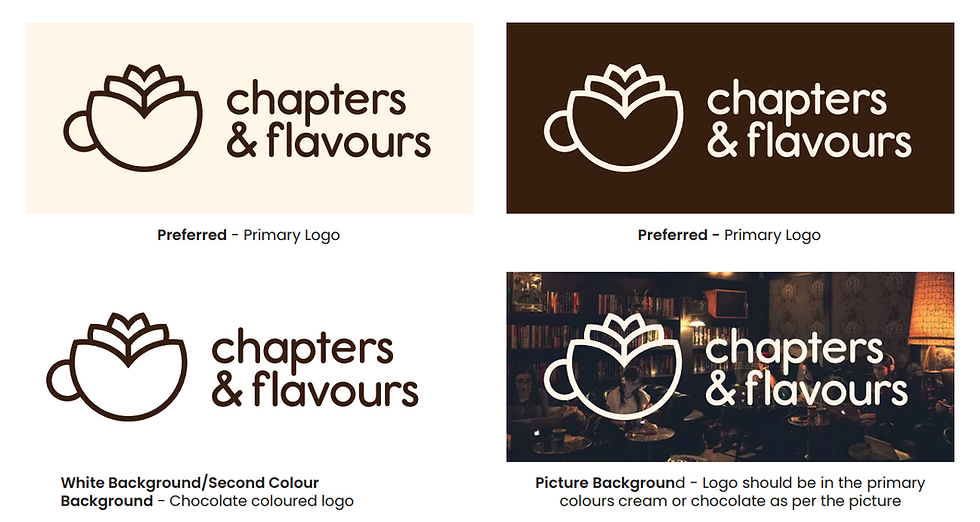
The logo serves as the most vital and visible element of the Chapters & Flavours brand identity. It is a unique and cohesive brand signature, composed of two parts: the abstract symbol and the brand logotype. When combined, they encapsulate our core philosophy: the pleasure of reading, fostering academic endeavors, and delighting the culinary senses.
The abstract symbol is an elegant abstraction, thoughtfully designed to communicate growth and soul. It is a fusion of three key elements:
-
The Book: Chapters, literature, and academic knowledge.
-
The Coffee: Flavours, warmth, and the café experience.
-
The Flower: growth, nurture, and the community's soul.


PRIMARY TYPEFACE - REPORT SEMIBOLD:
Selected for its clean, legible structure (ideal for logotype and headings), the typeface's soft roundness conveys the required cozy and peaceful aesthetic for a safe haven environment.
SECONDARY TYPEFACE - VERVEINE REGULAR:
This handwritten style is used for taglines and expressive content. It purposely injects the essential human touch and personal approach into the overall identity, ensuring the brand feels warm and approachable.

0606
REFLECTION
The Chapters & Flavours project was an intensive two-week dive that successfully moved beyond simple visual design to my first step into strategic brand development.
The rapid process involved continuous brainstorming, sketching, and final digital asset creation. I was also immediately drawn to the field of brand strategy, which I am now keen to explore in depth in the future.
My main self-critique centers on the initial research: while comfortable with the branding components, I should have researched more extensive brand strategy case studies (beyond the 5-6 reviewed). This experience highlighted the need for a deeper analytical foundation to achieve a truly comprehensive strategy and delve into the necessary "nitty-gritty" details.
(And, if I could change another small thing? I'd go back and create a much better logo animation!)


